A Tale of Frustrating UX and Covid-19 Vaccinations
During the COVID-19 pandemic, UC San Diego put out a call for volunteers to help out at their vaccination super stations here in San Diego County. The job would involve tasks such as checking people in, directing traffic, running supplies back and forth, watching over people as they waited 15 minutes after vaccination to make sure they were ok, and other such duties.
It was a wonderful opportunity to help out the community, give back, and as a bonus, volunteers were offered a chance to receive the COVID vaccine at the end of their shift. As this was before the vaccine was easily accessible to all, it seemed like a good opportunity all around, so I signed up.
After getting through the background check required for all volunteers, I gained access to the volunteer portal with the promise that I could then sign up for shifts. Excited, I signed up and requested the day off of work. When the day arrived, I woke up at 5AM in order to get to La Jolla in time for my early morning shift. There was a lot of fog that morning and the drive was rather treacherous, but I made it. I parked, walked to the volunteer center, and got in line to check in for my shift.
When I got to the front desk, however, I was informed I wasn't on the list for that day. Confused, I showed them the confirmation email I had received and pulled up the website with my name on the calendar for that day. The lady at the check-in desk sighed. This was clearly something she had dealt with often. She informed me that I had to wait for a second confirmation email and that the first confirmation email was only to inform me that I had signed up for a shift, not that I had received it. However, I was free to wait in the foyer in case they needed more volunteers. She gestured to a room that had about 20 other people waiting around.
Having taken the day off and made all that effort, I waited, hoping they needed some extra volunteers, but as I heard the lady continue to tell more and more people the same thing after me, I got a sinking feeling.
When they came to announce to our group that they only needed 5 extra volunteers and they would go in order of arrival, I was disappointed to learn that I wasn't one of the people who would be able to volunteer that day.
It had all been a big waste of time.
So, what happened?
In short, it was bad UX. Really bad UX.
Being a UX Designer, however, my first instinct was to come up with a better solution that would help make things more clear. Since I had the day off already, I spent the day feverishly designing a solution that would be more clear and eliminate this kind of confusion.
Here is that exercise:
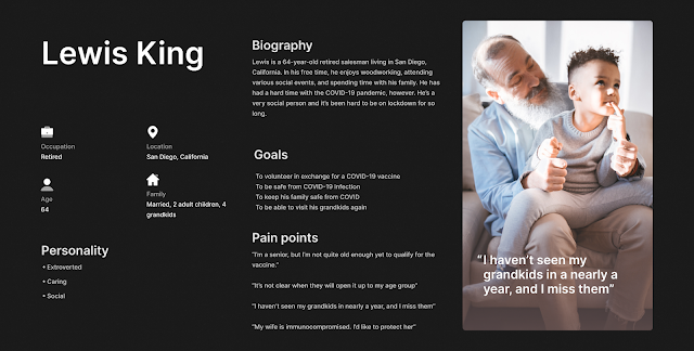
Personas
Flows
The Portal
Signing Up For Shifts
My Solution
- Moving the referred opportunities to the left instead of integrating them with the schedule eliminates confusion over whether or not those are scheduled shifts, or just the kinds of opportunities a volunteer is eligible to participate in.
- Changing the buttons to very clear indicators of status with both text and color indicators helps volunteers to know exactly where they stand. Instead of vague terminology, they can see 'placed', 'not yet placed', or 'canceled' and know with an easy glance if they are signed up for a shift or not.
- Adding the ability to withdraw pending requests, cancel shifts that are more than 24 hours in the future, or remove canceled shifts from the schedule with the click of a button makes it easier for volunteers to manage their schedule without having to call the phone number (which is manned by a bot, by the way)
- If a shift is within 24 hours, letting the volunteer know they need to call the number is appropriate in this case. However, only having that option show for tomorrow's volunteers instead of all volunteers frees up those phone lines for the most important calls.
- Adding help text below the buttons to further explain the status of the shift helps to clarify any questions the volunteer might have about the shift status.
- I updated the 'search for opportunities' box at the top to include more clear instructions on how to schedule a shift.
- I added frequently asked questions to the bottom of this page so that potential volunteers could easily access important information, which also helps the UCSD staff to spend less time fielding the same questions over and over.
- I added a tabbed system for 'all opportunities', 'placed opportunities' and 'requested opportunities' to the top of the schedule to allow users to only see the things that matter most to them.


Comments
Post a Comment